Kit’s bold rebrand: The surprising twist you didn't see coming! (MM #8)
Published over 1 year ago • 2 min read
|
Hi Reader,
The Convertkit to Kit rebrand broke all the rules. But here's the most surprising twist:
Instead of CEO Nathan Barry leading the charge, he handed the reins to Creative Director Charli Prangley.
The result?
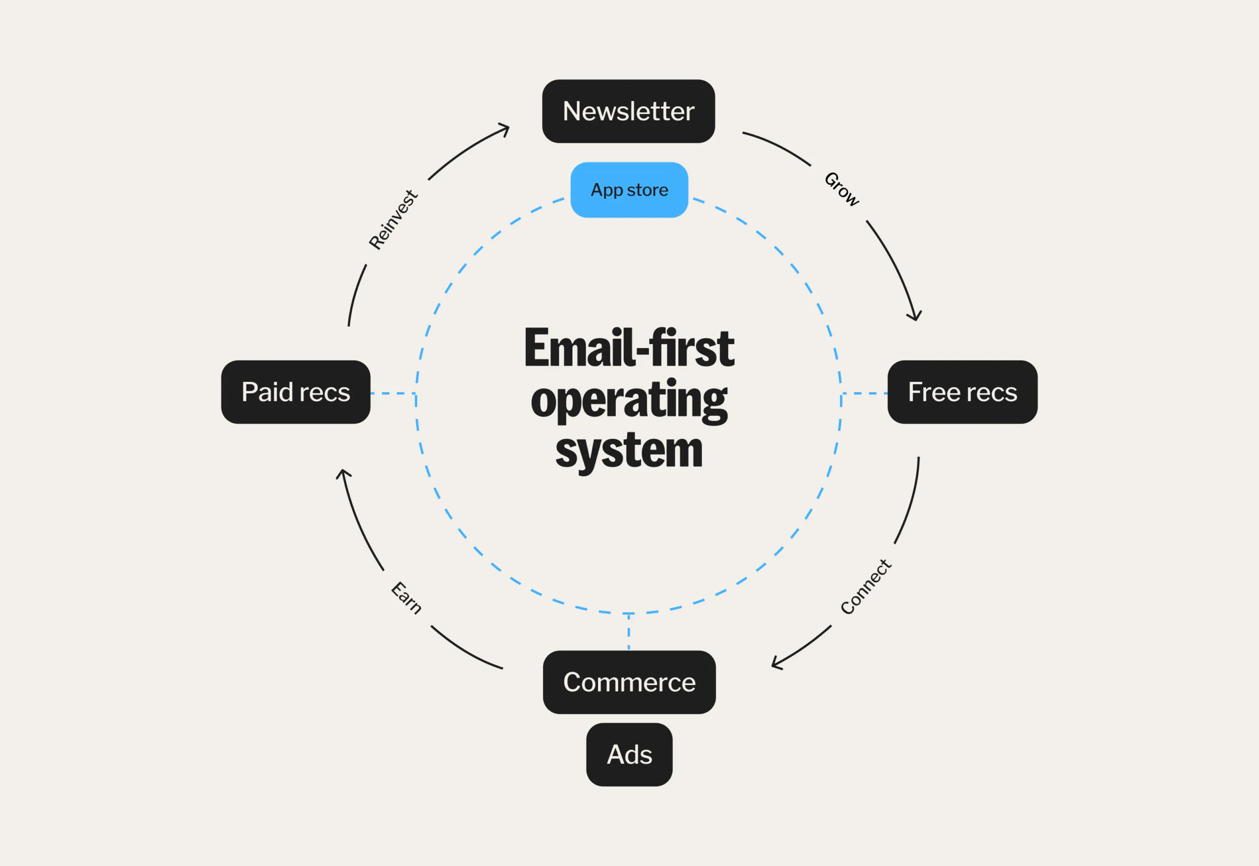
A bold transformation, developed in partnership with the London-based branding agency Koto, that repositioned Kit from an email marketing tool to an all-encompassing platform for creators.
Key Lesson: Empower the right people to drive key decisions at your company.
Here’s How Kit Did It – And the Lessons You Can Steal for Your Brand:
A Rebrand Rooted in Purpose
Kit’s transformation wasn’t just a new name and redesigned logo – it was a masterclass in branding done right.
At the heart of the rebrand were three core elements of Kit's new brand identity:
|
|
|
- Bold: Reflecting the courage to stand out in a crowded creator economy.
- Expert: Showcasing the platform’s rich legacy and deep understanding of creators’ needs from over a decade of insights
- Sincere: Staying true to the authenticity creators value most.
These principles influenced every aspect of the rebrand – from typography and logo design to color palettes that exude vibrancy and energy.
Ready to finish 2024 with a bang?
Let’s make it happen together!
Start by frontloading your work and watch your productivity soar. I’m here to help you:
- Attract high-quality leads
- Boost your conversion rates
- Launch your next big product
- Build and scale your personal brand
Don’t wait until it's too late — secure your spot now and let’s achieve greatness before 2025 hits. Book a time in my diary here.
|
Design with Intent
Kit’s new visual identity isn’t just visually appealing – it’s purposeful:
- Logo: The logo’s upward and downward arrows symbolize the value exchange between creators and their audiences. The “i” at the heart represents the creator, the driving force behind it all.
- Colors: The iconic Kit blue and vibrant gradients convey movement and inclusivity, keeping the brand adaptable across different platforms.
- Fonts: Custom fonts were designed for clarity and warmth, making the brand feel human and approachable.
Key Takeaway: Does your brand’s design do more than look good? Does it serve a purpose and resonate with your audience?
The Big Lesson
Kit’s rebrand wasn’t just about a name or look – it was a strategic leap forward.
By trusting the Creative Director's vision and focusing on its core audience of creators, Kit has built a lasting brand that stands for something bigger.
Here's How to Adapt Kit's Brand Playbook
- Fresh perspectives: Empower your team to make the big and small decisions.
- Creative risks: Rebrand for what you want to be, not just what you are.
- Audience-first strategy: Align your brand with what your audience truly values.
P.S. Whenever you're ready, here are 3 ways I can help you:
- Ace your Marketing – I can help with your brand's go-to-market strategy, marketing campaigns, email campaigns, website, content marketing and lead generation.
- Turbocharge your Career – Book a call with me to discuss time management, career changes, salary negotiation, or finding the right mentor and sponsor.
- Join a Global Community of High Achievers – Connect with me on LinkedIn and be part of a global community of 10,800+ leaders and changemakers.
|
|
|
|
|
With gratitude and macarons,
Neha Kirpalani
Founder & Chief "Everything Officer", Marketing Consultant, Personal Brand Strategist
600 1st Ave, Ste 330 PMB 92768, Seattle, WA 98104-2246
Unsubscribe · Preferences
|
|
|
|
